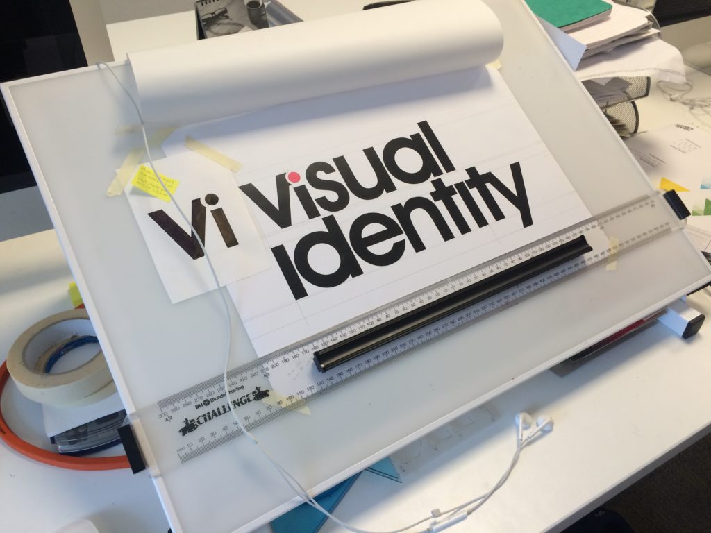
What makes a successful logo design?
Our Creative Director, Jon shares what he believes are the key fundamentals of a good logo: strength, uniqueness and balance.
Successful logos are immediately recognisable, reflect a brand’s message, and stand out from the crowd. They build trust and look timeless and professional. Effective logos also work at any size and anywhere.
From typesetters, to digital-wizards
When our directors first started their ‘creative’ journeys, they learned the traditional skills of ‘typesetting‘ and ‘copy fitting‘ – now a long-forgotten art in the main. Pre desktop publishing and Apple Macs – when everything was done by hand for designing promotional items for print, such as company logos, advertising posters, brochures, and stationary.
The process was essentially arranging the composition of text by means of physical character placement and counting. Letters, numbers, and symbols were ordered according to a language’s orthography for visual display.
The length and depth of text columns and the size of the typeface chosen for each piece had to be exact so that once printed, the layouts would fit exactly against it.
Another method was hot metal typesetting – which injects molten metal into a mould, lined up within a frame before being clamped and set in place.
Fast forward to the modern-day, typography is associated with both the digital world and print – yet it is often overlooked. It remains a crucial component as it always was – a key component of user interface design, it plays an important role.
Personalisation
Hidden meanings or unique elements within a logo can often provide the creative edge you have been searching for in your logo design. Symbols can make a subliminal difference.
Here in the Interact Medical logo, for example, a plus symbol (+) is used to indicate summation or positive quality. It was Aristotle, a philosopher in Ancient Greece, who said, “the whole is greater than the sum of the parts“, in this case, used to indicate that the service offered by Interact Medical is better than you would expect from the individual parts because of the way they together combine to add a superior quality different from their competitors.
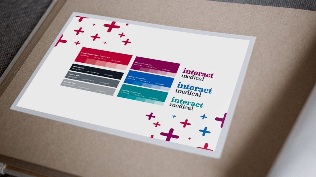
Client re-brand for a medical recruitment company
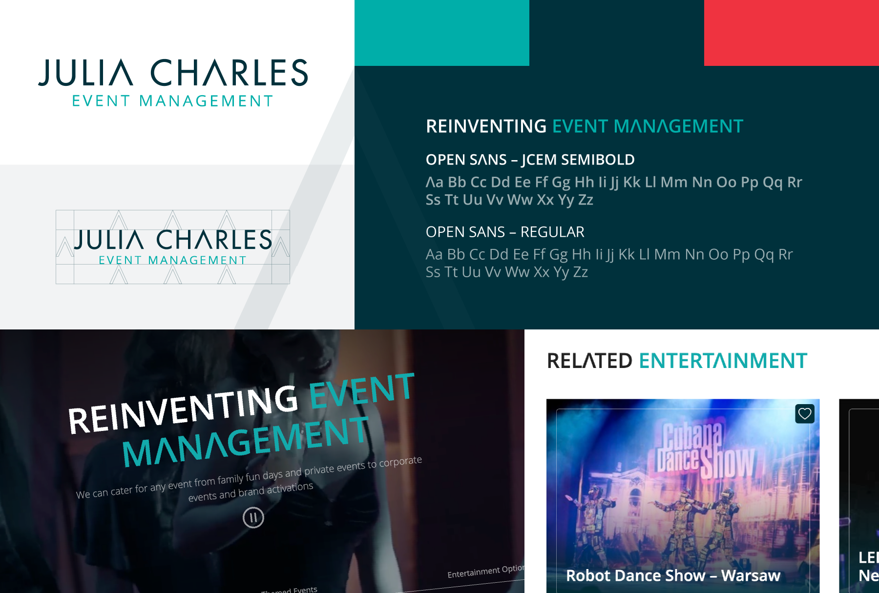
For Julia Charles Events Management the branding was further enhanced by customising and developing a bespoke web font, which included a “crossbar-less A” – coded for use within headline fonts. A simple adjustment, that was created bespoke to enhance the clients’ branding when viewed on the net and makes a real impact!
Design – The simpler, the better?

Personally, we’re all for the most recent – simplistic style of the logo, however, the 1977 version has real pride vibes, which we love!
Simplicity works!
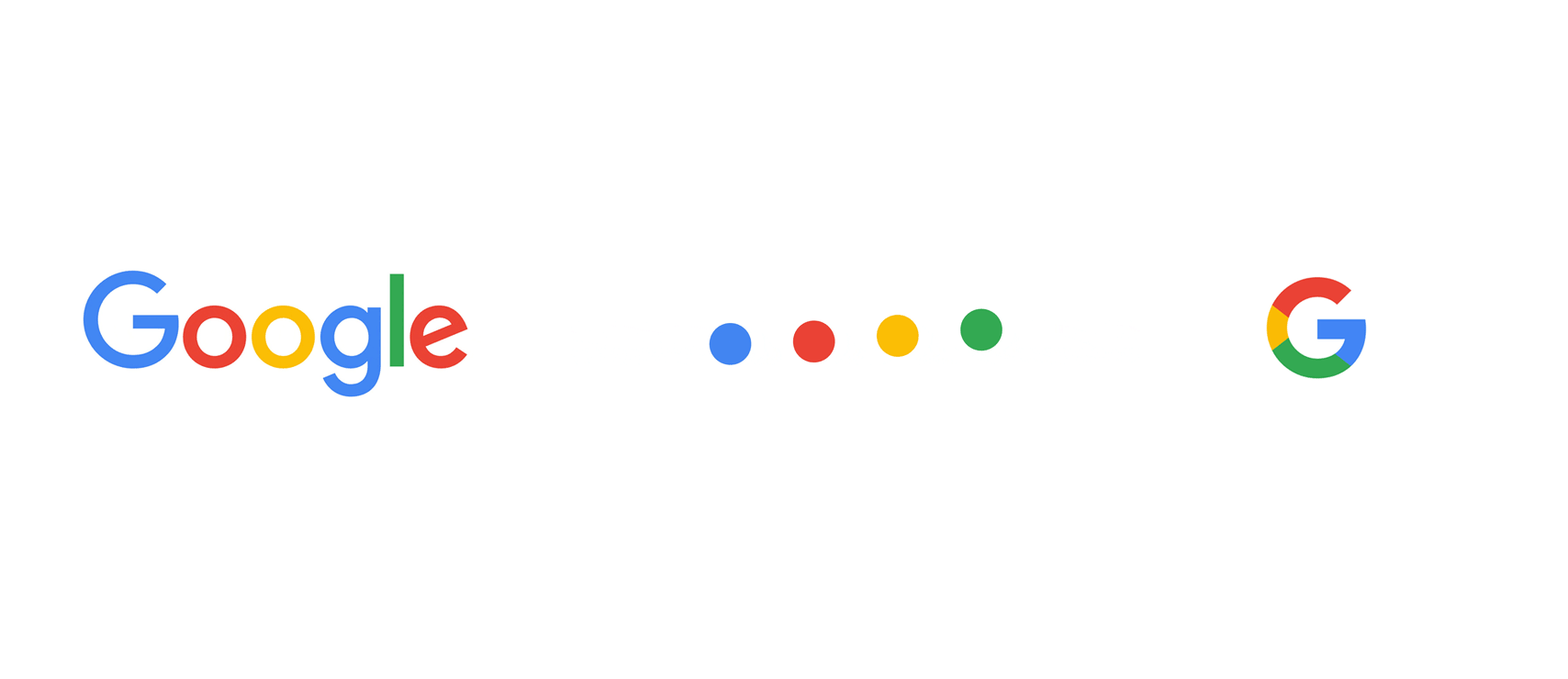
Once again, the simplicity of Google’s logo is clearly evident in its design. As with Apple, Google likes to promote how accessible it is, which is essentially what users know and love about the search engine.
For Michael Jones Jewellery, we recently recreated the client’s logo as a vector image for use on their new website (launching soon). Established in 1919, they didn’t own a vector image (best because it is infinitely scalability).
Over the years the original logo had lost its sharpness now being slightly bolder. The logo had developed rounded the ends to the characters. We wanted to take the logo back to its roots and improve its quality.
VI’s research and discovered that the logo is based on a really cool font called Le Griffe. Designed in 1973 by a French designer called Andre-Michel Lubac.
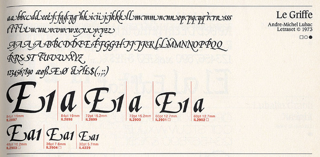
Originally a Letraset font, it was digitised sometime later for Linotype, however, they didn’t bother to digitise all the glyphs (flourishes). The image shows all the various versions of the ‘M’s’ and the ‘L’s’, to recreate accurately we had to redraw these and the lion which had also been distorted by age and duplications.
The final result produced a version that looks the same but is much sharper.
Be brand, not bland!
Good design speaks louder than words… and the power of typography cannot be underestimated.
Simple logo design is more memorable. Your customers are more likely to trust something they’re familiar with and are able to recall easily. … The simplest logos are able to embed themselves deeply into our minds and a fleeting glance is all that is required to recognise them.
Whether we’re working with a new start-up business or a well-established company – we always like to review the design and effectiveness of the brand before starting a new marketing campaign or project. After all your branding represents your company’s ethos and character.
Time for a change? Whether you’re looking for a whole new brand, or just a freshen up – Visual Identity would love to work with you to design the perfect ‘face’ of your business.
