We know how important it is for our business to keep evolving. After 28 years of design excellence, we felt the time was right. We’ve updated our branding for a fresh update to our strong and instantly recognisable logo.
This refresh ensures that our brand remains relevant while continuing to reflect the bespoke and familiar identity we’ve built over the decades.
28 years of evolution and creativity.
We’ve updated our branding
Staying true to our roots
We’ve always been proud of our brand, name, and reputation. While we were happy with our previous logo, we also believe that even great things can be improved. Our updated logo retains the core identity our clients trust but brings a new level of polish that reflects the high quality of work we deliver.
Showcasing in-house creative talent
This rebrand has been an opportunity to shine a light on our amazing in-house team, especially our talented typographic specialists. Their craftsmanship and passion are behind every curve and contour of the new design.
Design thinking at the core
At Visual Identity, we apply structured creativity to everything we do. Our approach is informed by the Double Diamond model – developed by the Design Council – which outlines four key phases: Discover, Define, Develop and Deliver. This methodology helps ensure that our work is always rooted in genuine insight, strategic clarity, and refined execution. The evolution of our logo is a perfect example of how we explore widely before honing in on a bold, effective solution.
A handcrafted typeface and a bold new colour
Our new look features a bespoke, modern, hand-drawn typeface and introduces a striking red—a colour chosen to symbolise strength, energy, and creative power. While the changes may appear subtle to some, the improved balance, dynamics, and attention to detail are clear to all.
Honouring the past. Embracing the future
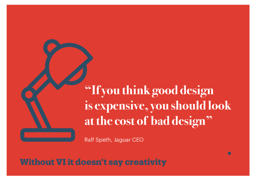
The new logo offers a subtle nod to our history while boldly stepping into the future. It represents everything we stand for: originality, excellence, and constant innovation. Because without VI, it doesn’t say creativity.
We’ve updated our branding! Can we update yours?
Visual Identity has always stood for more than design – it’s about creative partnerships that last. Our updated brand is just one part of our journey forward. Let’s create something beautiful together.
Get in touch today, and let’s talk about how we can help transform your brand.
Without VI it doesn’t say creati ty
Ready to evolve your brand?
If you’re thinking about a refresh or a complete transformation, let’s talk. At Visual Identity, we blend strategy, creativity, and craftsmanship to help brands grow with purpose and impact.
We’ve updated our branding – can we update yours?
Get in touch today.
VisualIdentity #VIVisualIdentity #Rebrand #DesignExcellence #BrandRefresh #CreativeAgency #TypographicDesign #DesignThinking #BespokeBranding #DoubleDiamond #MKCreative #DesignMK #CreativePower #StrategicDesign #ModernBranding #InHouseCreatives #WithoutVIItDoesntSayCreativity
