Celebrating the design heroes who inspire VI
Unveiling the UK-based design heroes whose work shapes our thinking, sharpens our concepts, and challenges us to be better creatives.
Visual Identity believes in the power of inspiration. Our creative journey is deeply shaped by the visionaries and design heroes who came before us – designers, illustrators, photographers and typographers who dared to innovate, question norms, and build beauty from function.
As lifelong admirers of creative genius, we also draw inspiration from icons like David Bowie – a boundary-breaking artist who famously used the ‘cut-up’ technique to write lyrics. By rearranging words and phrases from newspapers, magazines, and his own writing, Bowie embraced spontaneity and unexpected connections to ignite fresh ideas.
In that same spirit, we embrace traditional techniques like mind mapping, word association, and collaborative brainstorming. These foundational creative disciplines ensure our work doesn’t just speak – it sings.
This is our tribute to a few of our favourite UK-based design heroes and why VI loves them.
Vi’s design heroes
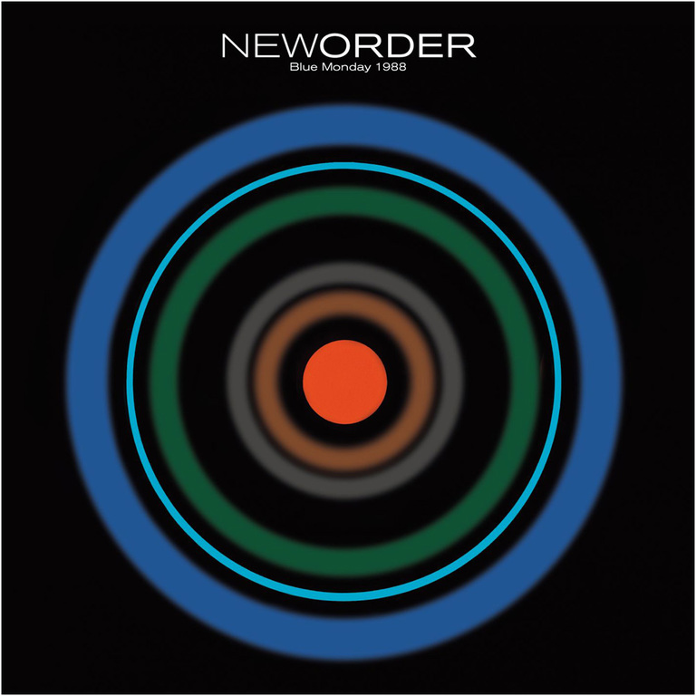
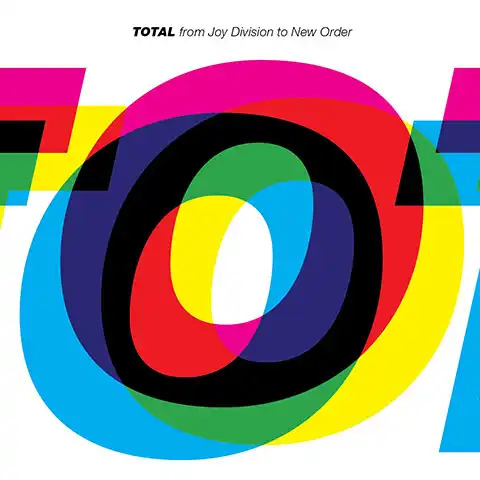
Peter Saville – The cultural alchemist
From Joy Division’s pulsar waves to New Order’s abstract elegance, Peter Saville redefined what album design could be. His work bridges pop culture and graphic minimalism, injecting emotion into structure.
Saville’s aesthetic is both cerebral and emotive – artfully composed, yet never devoid of feeling. His use of unexpected materials, avant-garde references, and abstract layouts challenged the norms of commercial design. He didn’t just package music; he gave it a visual identity that was as iconic as the sound itself. His early Factory Records work remains a benchmark for how branding can evolve into cultural commentary.
Why VI loves him: His ability to express music through stark visuals inspires us to always find meaning beyond the brief.
Wayne Hemingway – The social visionary
Wayne Hemingway MBE, co-founder of Red or Dead and HemingwayDesign, has built a career blending fashion, product, and placemaking with purpose. His focus on community, culture, and social value places him firmly at the heart of design for good.
Why VI loves him: Hemingway’s commitment to socially conscious design inspires us to think beyond the surface. His work shows how creative thinking can drive regeneration, inclusion, and sustainable change – values we strive to reflect in every brand and campaign we craft.

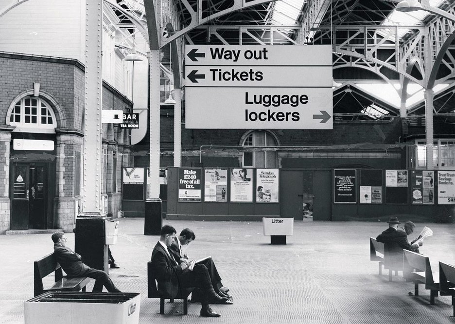
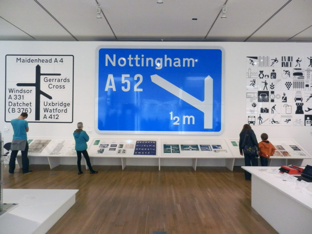
Margaret Calvert – The queen of clarity
A true unsung design heroine, also a fellow alumnus of UAL, Calvert created the iconic UK road signage system with timeless legibility and grace. She literally designed the way we navigate our world.
Working alongside Jock Kinneir in the 1950s and ’60s, Calvert developed the visual language for Britain’s road signs – using clean sans-serif typefaces, simple pictograms, and consistent structure to ensure clarity and readability at speed. Her designs have stood the test of time, proving that form and function can coexist beautifully. The Transport typeface she helped create is still in use today, an enduring testament to her vision.
Why VI loves him: She proves that good design isn’t always loud – it’s lasting. Her work reminds us that function can be poetic.
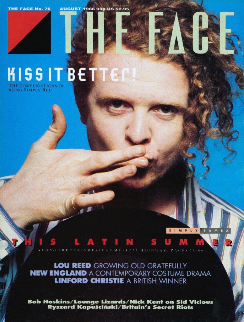
Neville Brody – The rule-breaking typographer
As art director of The Face, Brody reshaped editorial design with expressive type and fearless layouts. He gave form to rebellion.
Brody’s work in the 1980s blurred the lines between typography and visual art, ushering in a new era of experimental, postmodern design. He challenged the conventions of legibility and layout, proving that type could be more than just text – it could be attitude, atmosphere, and emotion. His influence extended beyond magazines into album covers, brand identities, and even digital fonts, making him one of the most influential typographers of his generation.
Why VI loves him: Brody taught us that typography is a voice. A loud, uncompromising, beautiful voice.
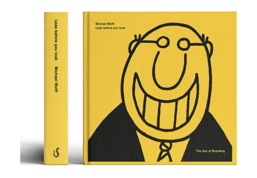
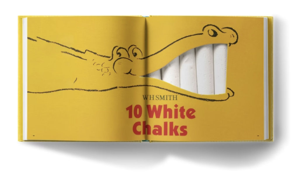
Michael Wolff – The human brand thinker
Co-founder of Wolff Olins, Wolff sees brands as living things. He champions design with emotional intelligence, storytelling, and integrity.
Wolff believes great design starts with listening to people, to culture, and to the world around us. His philosophy centres on clarity, simplicity, and humanity, elevating brand identity beyond logos and guidelines to something instinctive and authentic. He has worked with household names like Orange, Tate, and the London 2012 Olympics, always championing a brand’s deeper purpose over superficial style. His influence encourages us to create with empathy and consider the emotional imprint of every brand experience.
Why VI loves him: His work sits at the intersection of design and human behaviour – right where we do our best work.
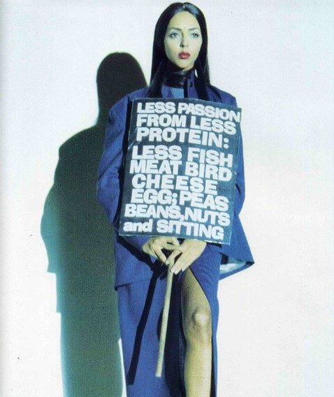
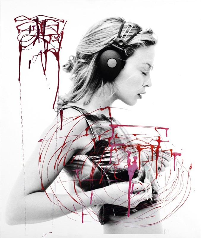
Rankin – The visual disruptor
Co-founder of Dazed & Confused, Rankin’s bold editorial photography challenges norms, champions individuality and captures iconic moments.
His work spans fashion, advertising, and fine art, always pushing for raw, unapologetic authenticity. Rankin’s portraits don’t just depict their subjects, they confront the viewer with vulnerability, energy, and attitude. Through his lens, beauty becomes diverse, truth becomes visual, and storytelling becomes visceral. He’s photographed everyone from The Queen to rebellious youth, always with the same fearless eye for honesty and impact.
Why VI loves him: His eye for contrast, confidence and human truth makes him a constant source of visual reference.
Tim Brown – The web typography pioneer
As a type advocate and design lead at Adobe and previously at Typekit, Tim Brown helped shape responsive web typography and scalable type systems.
Brown’s work has been instrumental in promoting a deeper understanding of how typography adapts across devices and screen sizes. He introduced the concept of ‘modular scales’ for digital design, enabling consistency, rhythm and hierarchy in flexible layouts. His writings and talks have helped designers across the globe understand how to blend typographic tradition with the demands of modern technology.
Why VI loves him: His web-first thinking and passion for clarity in digital design resonate with how we build brand systems for online performance.
Final thought!
These creative legends don’t just design – they inspire, disrupt, and lead. Visual Identity stands on their shoulders. They remind us every day to be curious, brave and never stop creating.
We live this belief every day – through our mentoring of emerging creatives, our collaboration-first studio culture, and our commitment to challenging our clients (and ourselves) to aim higher. From branding to digital builds, every piece of work is an opportunity to honour their legacy while writing our own.
We carry these lessons into every project: always asking ‘why?’, pushing visual boundaries, and choosing concept over convention. Whether we’re refining a type hierarchy or crafting a bold new brand story, we design with integrity, passion, and purpose – just like our heroes.
Who are your design heroes? Let us know on social – we’d love to hear from you!
Follow and tag us:
Twitter/X: @vi_creative
Instagram: @visualidentitycreative
LinkedIn: Visual Identity Creative Ltd
Facebook: @visualidentitymk
From ‘Zero to Hero’ – Is what we do best!
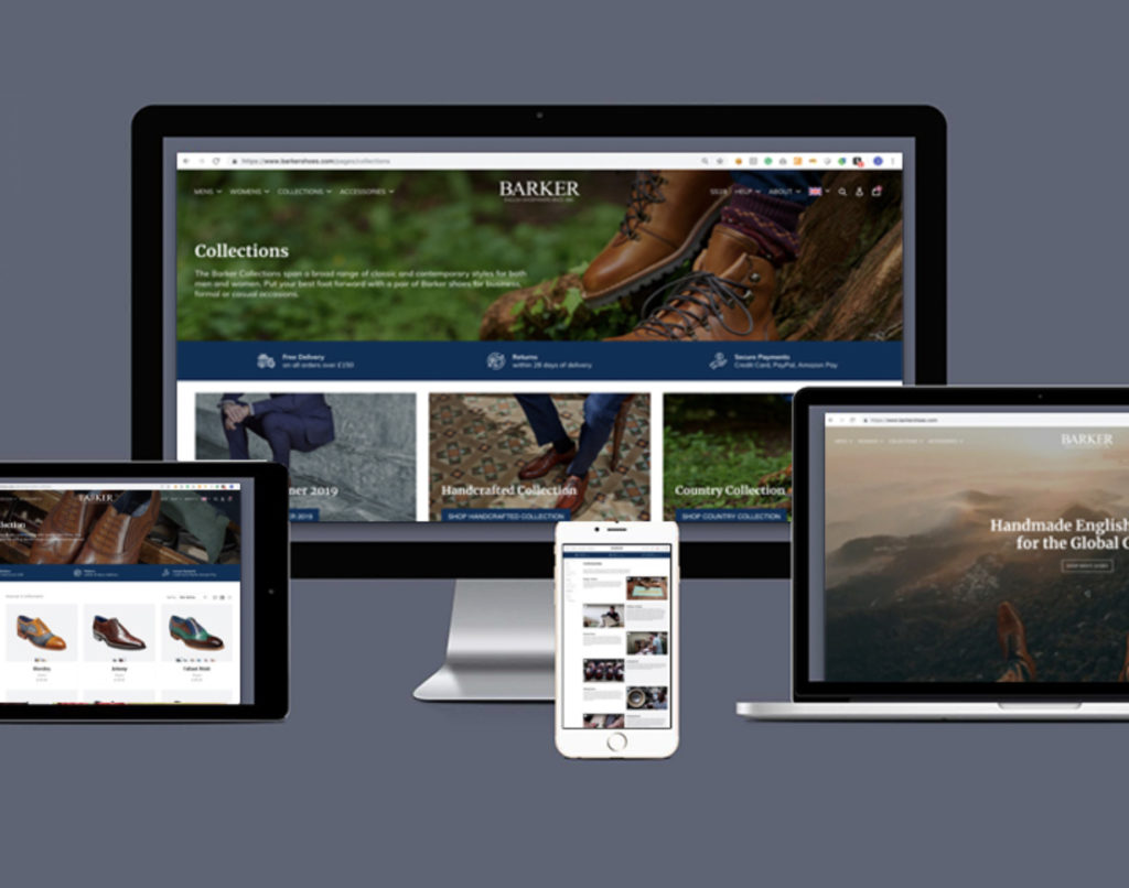
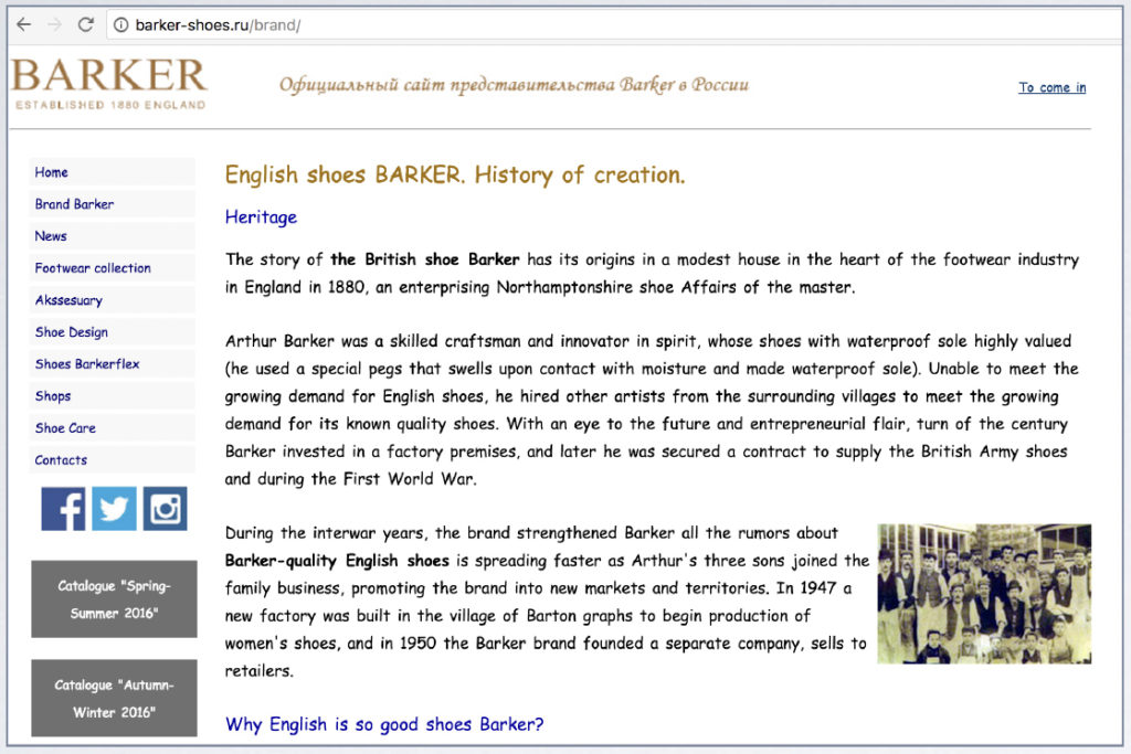
We pride ourselves on transforming underperforming digital platforms into high-performing brand experiences. From legacy websites like Barker Shoes to other e-commerce and service brands in need of a breakthrough, we’ve consistently turned outdated or overlooked assets into standout success stories. This is where we excel – and we thrive on helping our clients make that leap.
Inspired by our design heroes?
Whether you’re a brand ready to evolve, a startup looking to stand out, or a creative spirit seeking collaboration, get in touch with the VI team. Let’s create something extraordinary together.
? Contact us
? hello@visualidentity.co.uk
#DesignInspiration #TypographyHeroes #BrandIcons #CreativeLeadership #VisualIdentityCreative #DesignUK #PeterSaville #MargaretCalvert #NevilleBrody #Rankin #KateMoross #WebDesignIcons #UXHeroes #UKDevelopers #DesignInspiration #TypographyHeroes #BrandIcons #CreativeLeadership #VisualIdentityCreative #DesignUK #PeterSaville #MargaretCalvert #NevilleBrody #Rankin #KateMoross #WebDesignIcons #UXHeroes #UKDevelopers
